With a new corporate design, the museum is on the way towards its new Core Exhibition in the Zeughaus
25 June 2026 Reading duration 3 Min.
Since the beginning of May, the Deutsches Historisches Museum has been presenting itself to the public with a new corporate identity, featuring a new logo, new colours and a new typeface.
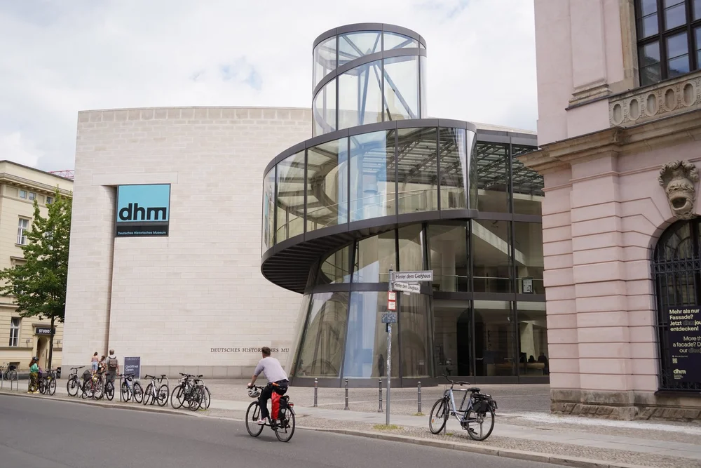
The new corporate design at the Pei Building of the Deutsches Historisches Museum © DHM / Yu Minobe
Logo, colours, typography
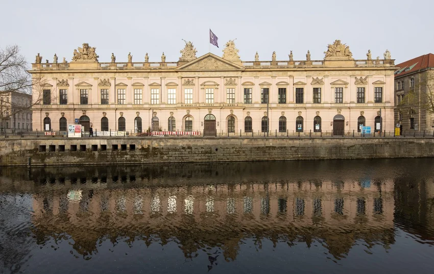
The new logo replaces the previous abstract “D” with the abbreviation “dhm” – a designation that has long established itself in general usage. It is characterised by consistent lower-case lettering, a geometrically precise design, and balanced proportions. The “m” is more striking than the “d” and the “h”, evoking the round arches of the Zeughaus and thus referring to the museum’s location in Berlin’s historic centre.
As part of the DHM’s brand architecture, the Zeughauskino is clearly recognisable as a sub-brand.
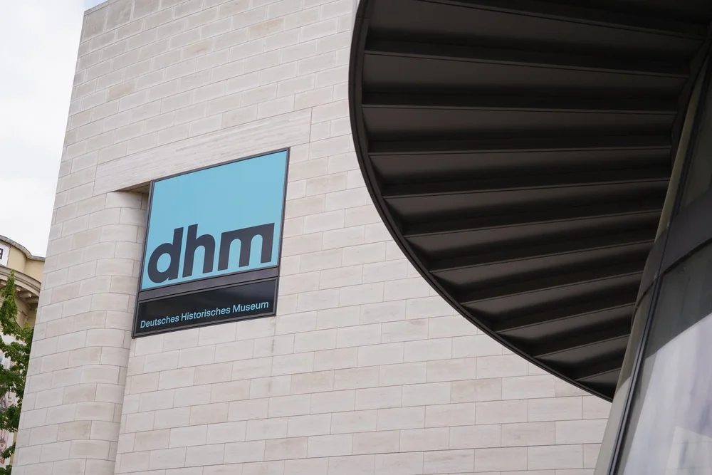
Panoramic windows at the Pei Building © DHM / Yu Minobe
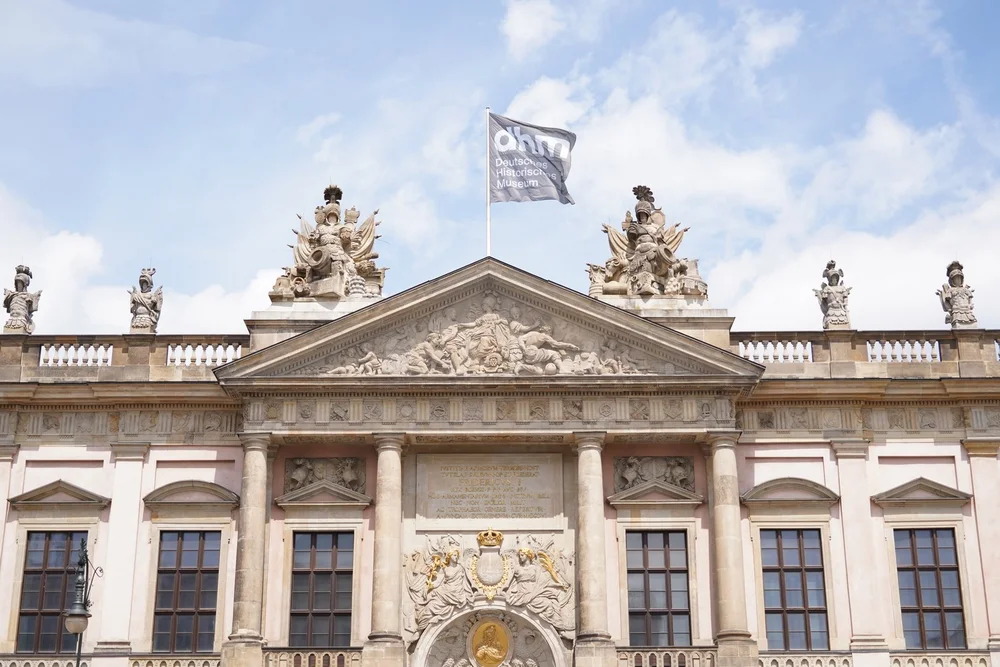
Roof flag on the Zeughaus © DHM / Yu Minobe
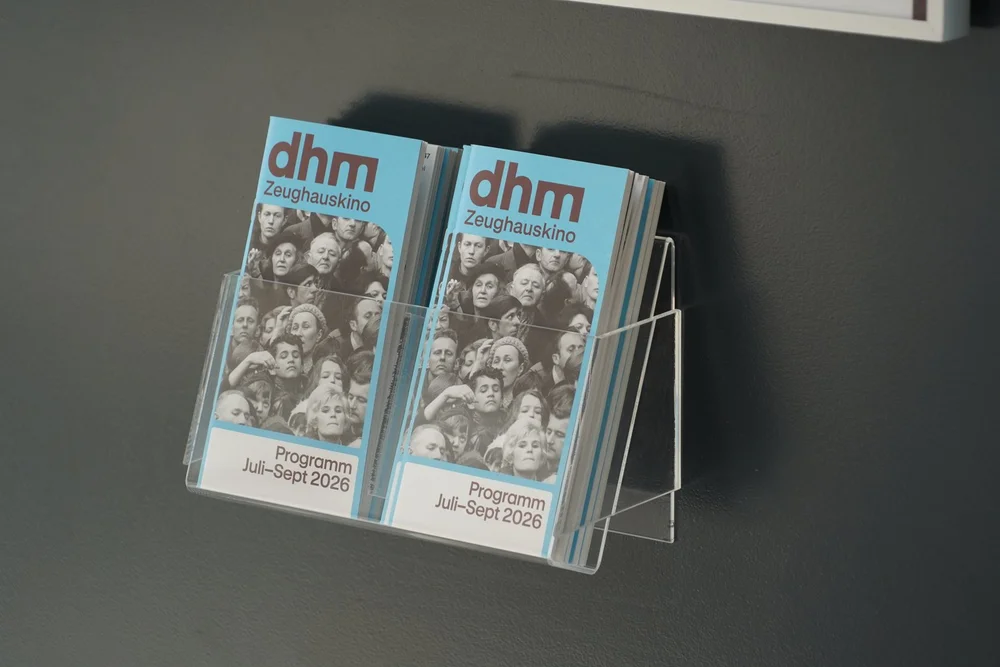
Zeughauskino programme © DHM / Yu Minobe
Open colour and typography system
The logo can be used flexibly for various designs. Its colour palette can be expanded as required. A conscious decision has been made to avoid fixed institutional colours, allowing the colour scheme to be adapted to the theme, channel and target audience. The open colour and typography system provides the flexibility required for contemporary communication.
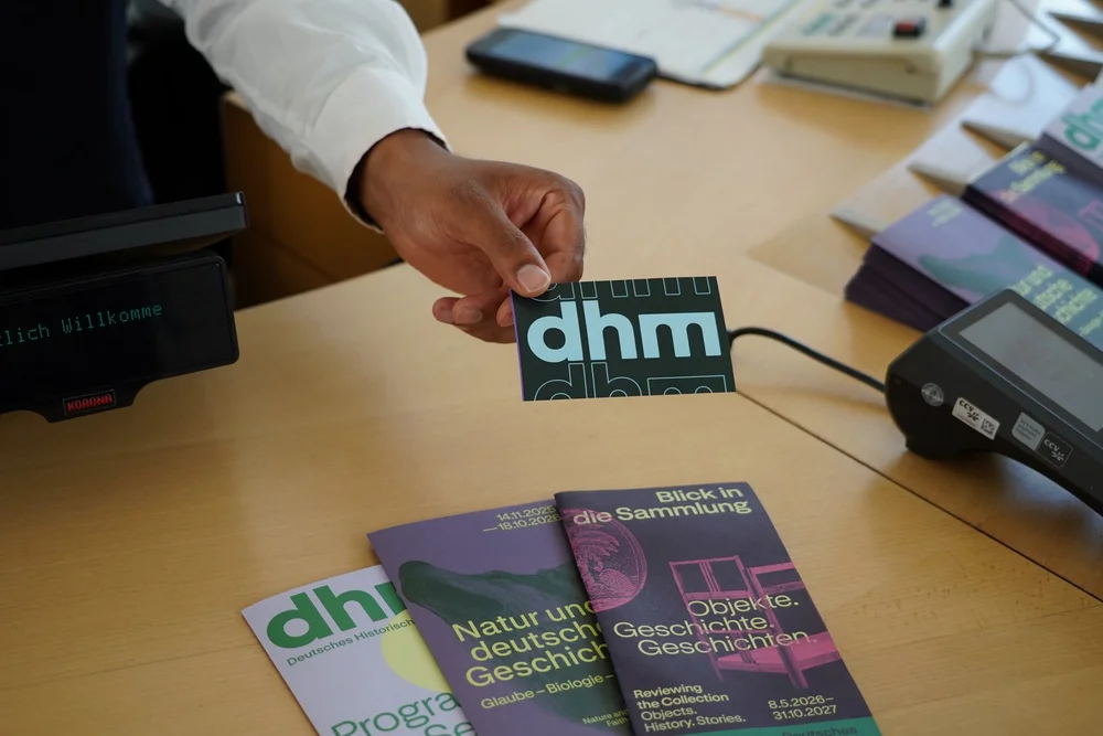
Admission ticket, exhibition and programme leaflets © DHM / Yu Minobe
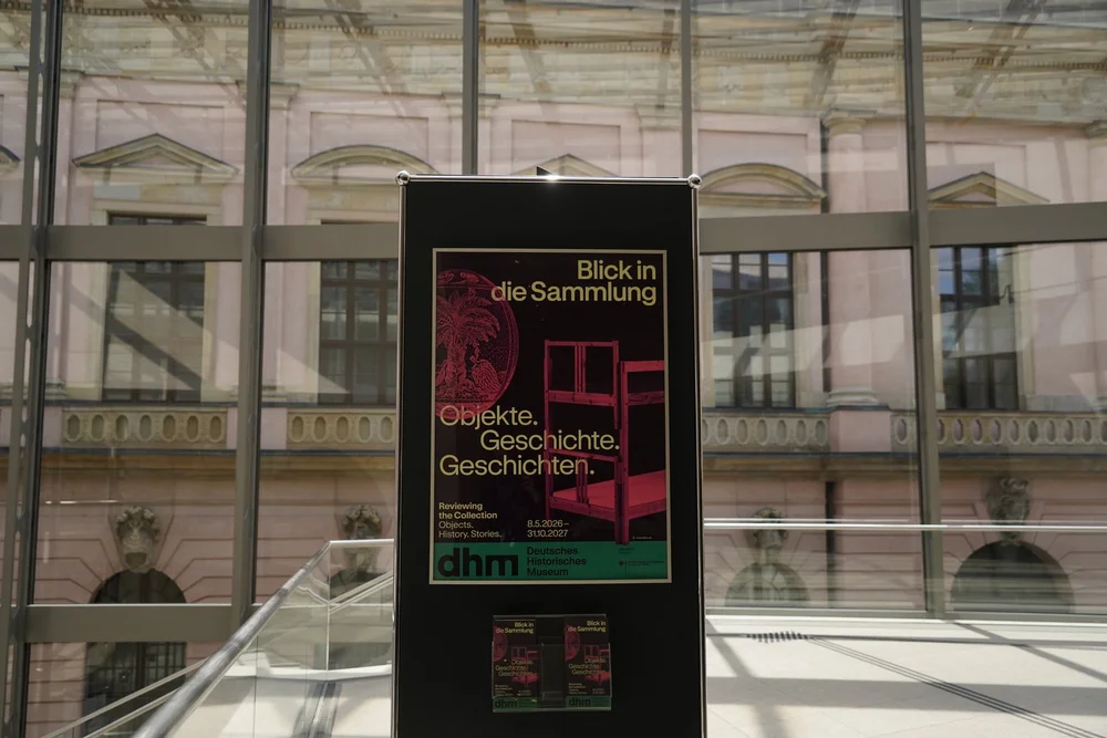
Exhibition poster “Objects. History. Stories. Reviewing the collection” © DHM / Yu Minobe
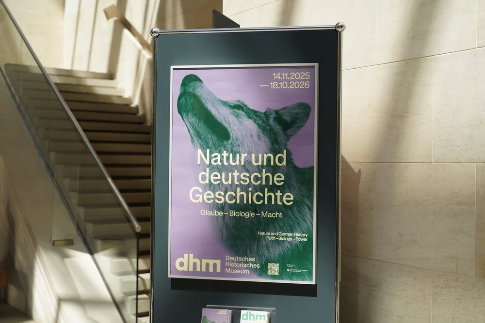
Exhibition poster “Nature and German History. Faith – Biology – Power” © DHM / Yu Minobe
The Swiss font GT Standard was chosen: a versatile, comprehensively developed and precisely designed typeface that meets all design requirements. Depending on the application, different sizes can be used, ensuring a very high level of accessibility.
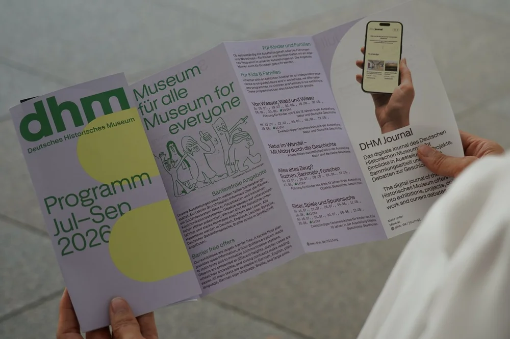
Programme leaflet: July – September © DHM / Yu Minobe
Why a new corporate design?
The DHM’s old corporate design was introduced around 13 years ago. With this fundamentally new visual identity, we are responding to significant changes both within and outside the DHM. It enables the museum to meet the challenges posed by rapid technological development, digital communication, and an increasingly competitive cultural and museum landscape.
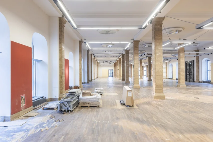
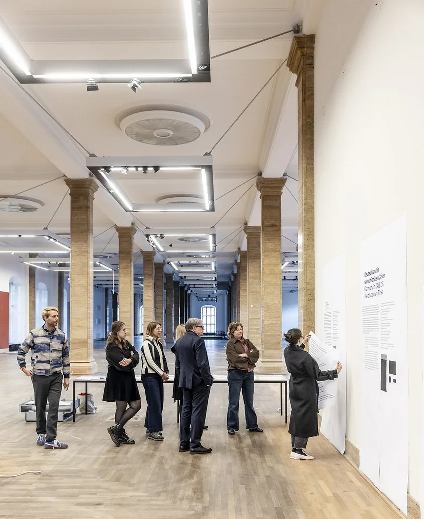
The visual identity was rolled out from early summer 2026 and constitutes the design foundation for the future. It provides the framework for the coming years – robust enough to integrate sub-brands, yet flexible enough to allow campaigns and exhibitions to speak for themselves. The new corporate identity also lays the visual groundwork for the communication strategy ahead of a significant event in the institution’s history: the reopening of the Zeughaus following its refurbishment, featuring a new permanent exhibition.
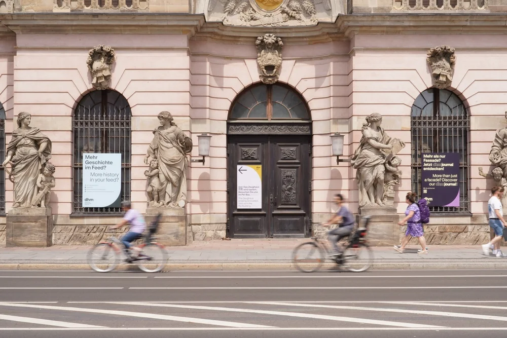
Signpost at the Zeughaus © DHM / Yu Minobe
The Author
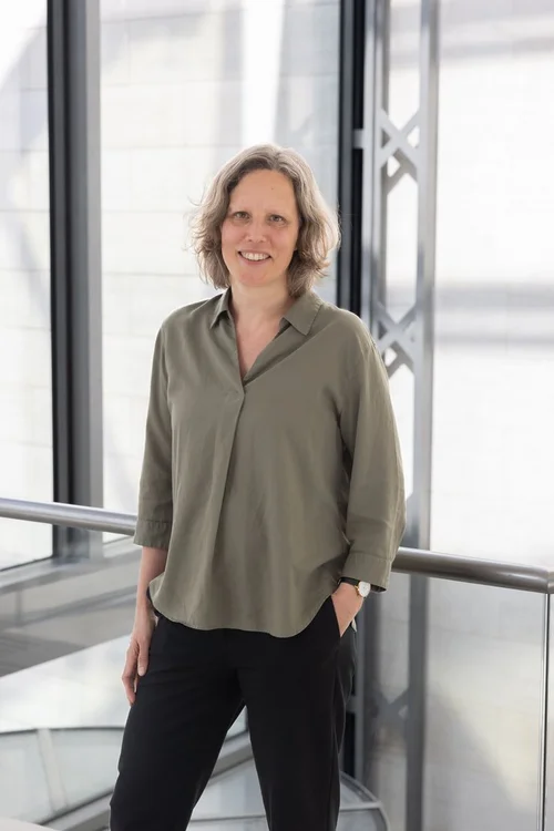
Nicola Schnell
Nicola Schnell is a Marketing and Internal Communication Officer at the Deutsches Historisches Museum